Thursday 5 May 2011

PRINT TO PIXEL - FINAL ANIMATION!!!!!!

I finally finished... I decided to have the plain background so that the figure was more visible.

Hope you like it :) - took me ages!!!!


DONE!!!

PRINT TO PIXEL - Animation!

I like both of the choices for my final animation...

I like the background but I think that it distracts away from the moving figure which is the main feature of the whole animation. 


This is the video with the background.


PRINT TO PIXEL - My Images!

I drew out some sketchbook pages on what I did and how I created each of the frames. Each image was edited in Photoshop before then Importing them in to After Effects and cutting each image to last only one frame.


I opened up the image I scanned in earlier in Photoshop so that I could edit it and keep just the figures outline.


I then used the "select" option at the top of the page to select just the shadows on the page - hence only selecting the dark outlines. Any parts I don't want to keep in the final drawing I then deleted to keep the outline of the figure the only thing on the page.


I then selected the outline and saved it as a photoshop document to then use later on.


I also added clothing to some of the figures for the final 10 seconds. I had them saved separately so that I could add them in Photoshop.


I selected each piece of clothing separately and moved it into the right position so that it would look like they had been drawn on originally.


I took the Photoshop images into After Effects and layered them all to make each image only one frame each. I layered them over the top of each other to make sure that I had them all lined up perfectly and the animation would flow well.


By having the images as a progressive step sequence it means that when the clip is played they will all show when they should, making a perfect animation.


Due to the number of frames I drew out, the image sequence flows really well and it isn't really obvious that it was made up of multiple images - this proves to me that I have done a good job.


I had about 332 frames or more in total all on different layers so I used the "hide layers" tool to stop me getting to confused. By also locking each layer it means that once I've put the layer where I want I wouldn't  accidentally change it - I spent over 14 hours in the library straight trying to do this!!!


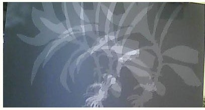
 I also tried to have a background on my animation - I used one of my successful ragograms to create this  background. I lowered the opacity so that the figure was still visible as it is the main feature.


For the end credits, I added my name - each letter is added a couple of frames at a time so that it looks like it is being typed like a typewriter. 


This screenshot shows a fraction of the layers involved in my animation. This really shows how much work went into producing it.


I saved lots of images and files to my desktop so that I had easy access to all of the things I needed to create my animation.


PRINT TO PIXEL - Final Storyboard!

Here is my final storyboard with the plan of what I will aim to follow for my final animation...


PRINT TO PIXEL - African Dancing!

I researched into african dance to make sure that my animation was as realistic and would fit well to my music as the video I used as inspiration has similar music style to my audio track. Here is the youtube video I watched to get my dance moves.


I think that this dancing is really energetic and would fit very well to my audio track. Here are the dance moves I came up with, inspired by the video above : 


1- side stepping motion, upbeat and bouncy (possibly repeated)


2- Duck down and high jump, very energetic.
3- spiral leg kick, the arms tend to follow the movement of the leg in a fluid movement.


PRINT TO PIXEL - Evolution line!

I drew out the different stages of an evolution line - going from monkey to fully standing man. As he goes up the line, different things happen such as him scratching himself and eating a banana. By adding the extra things that happen throughout the evolution process it adds a comedy value making my animation much more entertaining. By doing this mock up of an evolution line I now have more of an idea of what drawings to do for the process and how many frames I need for each part.


I worked out how many frames and what length of time to spend on each part of the evolution...
a 30 second animation = 360 frames (12fps)
evolving- 20 seconds (0s-20s) = 240 frames

dancing- 10 seconds (20s-30s) = 120 frames ( I may also be able to repeat some of these frames to make the drawing process faster and more efficient.) 

Monday 11 April 2011

PRINT TO PIXEL - My Story.

These are the pages of notes I jotted down about my chosen animation. I will have an ape evolving into a man (from earlier research) and also include the repeat patterns around the edge in time with the music. I also drew out the start, middle and end frames of my storyboard and had a small brainstorm about what background could be used.


I really like the idea of a colour wash and using the rayogram. I will have to experiment with both and see what happens.

PRINT TO PIXEL - Cell Animation.


We had a cell animation work shop in which we drew out 36 frames on paper overlaying them so we know where to draw, which were to be scanned in for a later date. I created a couple of pages of character ideas (using simple shapes) to begin.


Here is the character I chose to use for this cell animation. I drew him from all angles so that when I was drawing him I would know what to draw from any angle.


I decided that the ghost would float across the screen to a mirror, scare himself and then end up crying at a close up. I drew this is 3 frames to give myself a basic idea of how to work it. I will draw 24 frames from the start to the middle and then the final 12 to get to the end frame.


I will scan these final frames in and piece them together using animating software - when I have done this I shall upload the video.

PRINT TO PIXEL - Rayograms 2.

After my first go at creating rayograms in the dark room, I took the rest of my light-sensitive paper and had another attempt to try out some different objects and techniques.


Coloured lighters.

Here is the test strip I did to see how long I should expose the paper for to get the best results. I exposed it in stages of 5seconds between 5 and 20 seconds.


I found that 10 seconds was the perfect exposure time to create a good image and show that the different colours exposed differently.


I used the trays of developer and fixer to finish this image as apposed to putting the paper into the machine. I used a paintbrush to select certain areas to develop rather than the whole thing.


I used the same technique on this image as I did above, I brushed less developer on to this one to make the image appear more vague.


I experimented with moving the objects every 3 seconds of exposure time - however this test didn't work very well because the paper was still exposed a long time. 


This experiment of moving the object worked much better than the last one as overall I didn't over-expose the paper and you can see faint outlines of the lighter.


A five pound note.

This was my test strip for the five pound note. I did steps of 3 second exposure times between 3 and 15 seconds. As you can see none of the results are particularly brilliant.


Here is my final five pound note, which I decided to expose for 20 seconds after looking at my test strip. I like the effect because you can almost see through it.


A small branch.

The test strip was exposed to 5, 10, 15 and 20 seconds. The best result for this one I think is the longer exposure time.


This is the full exposure of 20 seconds after I had done the test strip. I like how the white stands out so strong against the black background.


I tried moving the plant similarly to how I moved the lighter earlier. I kept a short exposure time of 2 seconds between movements and I also only moved it a few times. 


I used the same technique as the previous rayogram however this time I exposed it more times therefore the image appears darker.


I really like the forest-like look that the small branch gives off when moved. I might be able to incorporate this somehow into my animation ... maybe as a background.