Wednesday 30 March 2011

PRINT TO PIXEL - Stop Motion.

We had a Stop Motion workshop in which we were taught how to create basic animations using a camera and a computer programme called I Can Animate. We used small toys in groups of 4 or 5 to create a short animation. I really enjoyed this workshop as it taught me a new skill which I hope to expand on. Since this workshop, I have downloaded I Can Animate and would like to have another go at home in my spare time.

Here is the short animation that I created along side Joe Johnson, Max Lawrence, Sach Limbachia and Ellie Langley.


Obviously as this was our first ever animation, It's very rough and there are obvious jumps, however with practice I hope to be able to create a more impressive animation and add sound to have more impact.

PRINT TO PIXEL - Initial Ideas.

While playing my piece of music (on repeat), I starting making some rough notes in a sketchbook to help me out during this project.


I started by drawing out a mind map of words that I thought of while listening to "Tribal". I thought that this would be a good starting point to help me think of the 3 words needed to start coming up with a story board.


I then thought about what colours I felt related well to the music, this would be useful as having the right colours in my animation would be important to relating to the audio track.


I then looked further into tribes as this was the first impression I get from listening to my audio track (without first looking at the name of the track) - I wanted to think of a more unique and individual idea, possibly based around the basic idea of a "tribe". 


This then helped me choose three words, which after listening to the audio track multiple times, I felt related well and would be a good base to help em come up with a story board for my animation.


I intend to look into this further as I develop ideas for my storyboard. Now that I have the words "Celebration", "Rhythm" and "Personality" I think that my animation will have a happy outcome and it should definitely follow the strong rhythm of the audio track I have. 

Friday 18 March 2011

Final PAPER poster - task 2!

For the poster, I took the sculpture that I had created (relating to 100) and photographed it using a Nikon D60 to get good quality images. I had never used one of these cameras before but the workshop we had on using them became extremely helpful. I have learnt new skills that I hope to use again. 


This was my original image. I really likes the shadow detail on it and the way the Black sculptures stand out against the white background. I also think that it was lit very well, showing all of the beautiful angles and curves.


I cloned out the imperfections of the image such as the wall and the edges of the paper, also continuing the shadow to make it look professional. I then took the "100 years" and altered the opacity as to let the image shine through. By using the dropper tool I could also keep the purple colour continuous throughout the poster.


This is my final poster, I decided to layer the font over each other like the poster design I looked at earlier. I like the way that where the layers cross the font is darker. I also added the date and place to the final poster. I placed these in the bottom left hand corner to balance out the image. I chose not to put the logo of GFSmith on the poster as I thought it may look too busy and I think that might distract away from the beautiful shapes found in the sculpture.

I am very happy with my final piece and I think that it could be easily used as a poster to advertise GF Smith. If I was to do this project again, I might consider using different backgrounds to photograph it against or even more lighting to possibly create more striking shadows.

Thursday 17 March 2011

Task 2 PAPER sculpture!

How I made my final sculpture for task 2. By using a template, I could make sure that all of the spirals are exactly the same size and shape. I think that this was a good idea to make my final sculpture much neater.

One black spiral. 99 more to make!


This is how I stitched 6 of these spirals together in 2 different places to make sure they were strong and sturdy enough to be hung and photographed.  


Me stitching the spirals together.


A final set of spirals. I will have to make 16 of these to create my final sculpture which is then to be photographed for my final poster.


I really like the curves on this shape. The set of spirals creates some lovely shapes and shadows.


3 down... 13 to go! When I have 16, I can start putting them together and working out a structure.

GF Smith PAPER research!

I thought that looking into the company I was creating a poster for would be a good start to task 2. I had a quick look online and all though I didn't discover much, I did get some small pieces of information that may be useful when constructing my final poster.


Their pieces / adverts tend to use very simple fonts which I think I will take forward and be inspired by when creating the poster for their 100th birthday.


This is GF Smith' logo. If it looks like my poster needs it, I will try to incorporate it into my final poster. 


I like how they have layered the typography over each other, it makes it interesting to read rather than having letters standing on their own over a plain background or image.


Relating my sculpture to 100!!!!

I scribbled down lots of notes on how to relate my sculpture to 100, but I think I will use the spiral technique I used for the sculpture in Task 1. I will have 100 of these spirals. I have worked out that by joining 6 of these spirals together and having 16 of these sets plus 4 extra spirals, gives me 100.

Thursday 10 March 2011

Task 1 PAPER sculpture - final!

I took my idea of a spiral that I worked on earlier as well as the inspiration of Richard Sweeney' spiral that was created in a similar way. I decided that if I made a few of these spirals, I could then join them together in a way that would make them much more visually interesting and more impressive as a sculpture.


I first created a rough version to see how it would look and how to secure it together. For this version I used staples to keep it together, however I wont in my final piece, because I think they look messy.


This is the template I created to make sure all 6 spirals were the same size and shape. I thought that this would make it easier for me to attach them together.


Here is one complete spiral. It has a lovely shape to it and the spiral seems to flow really well as one piece that continuously goes round. To secure the paper in place, I used a needle and white thread to stitch the pieces together - making the joining point less obvious and neater.


After making six of these spirals, all identical in size and shape, I needed to attach them together in the pattern I worked out earlier on to create the final piece. I stitched them together two at a time then also added some clear tape to make them extra secure so that it would stay together when hung. I did however keep the tape on the inside, as the piece is designed to be viewed from the bottom.


This is my final piece, I photographed it from below with specific lighting as it was designed to be viewed. As you can see, where area's of paper overlap there is a darker part on the photograph.


Wednesday 2 March 2011

8 hours of PAPER manipulation later!

I thought about some of the techniques I'd learnt and also about how nature uses repetition and it gave me the idea to use one of the shapes I had created earlier (the spherical form - tabs on the outside) as this already contains repetition of triangles with tabs etc. and expand on it. I decided the best way to do this was to create almost a chain of these balls all joined together. This is how I went about doing it...


1) I created a template for my shapes using an equilateral triangle of 5cm edges. Using a compass I created curved tabs which will later be used to attach the sculpture together.  


2) I cut out lots and LOTS of the template on black card as I thought my sculpture would stand out in a darker colour. 


3) I used a scalpel to create score lines along where the triangle edges were before stapling the tabs of the pieces together. Having 5 corners joining at one point.  


4) As I started joining more and more of the small pieces together a spherical shape began to form and by using a template earlier on, the pieces all fitted together much better than when I first attempted the spherical form.


5) Rather than adding a final piece in to complete the sphere, I attached 3 other pieces to the tabs and started forming another sphere that joined easily and strongly to the original.


6) As you can see I created several spheres all joined up almost like a chain with some having more joins that others. One of the center spheres has three that join on to it.


7) I decided to alter the material I was using slightly by using white card. This would draw attention to my piece as it will now be two strong shades - Black and White.


Here are some photographs of the finished piece. Hopefully I will take some better ones with a better camera VERY soon!


Repetition in nature to inspire my PAPER model

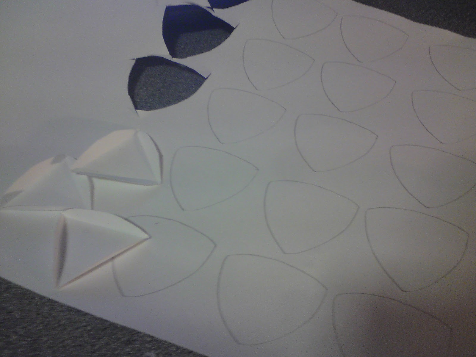
To inspire me in the making of my Piece to be hung in the Atrium of Sheffield Hallam, Sheaf building, I took a look at Nature. Nature is full of repeat patterns that are much more noticeable once you open your eyes and really look.  In fact, nature is designed in such a way to be repetitive. I thought up some way in which the repetition was particularly obvious and browsed the internet to find images to demonstrate this. I would have sourced primary images, however it would be EXTREMELY difficult to get some of these shots (especially sand dunes and waves as I live in Sheffield!).


1) Clouds are maybe less obvious, however if you look they all have similar patterns and they are all almost rough copies of each other.


2) This fern leaf has several repeats. Each set of leaves coming off the main stem is a repeat of the others. If you also look really closely, there are hundreds of small leaves that make up the larger ones. They are repeats too.


3) This flower shows repetition in multiple ways too. The petals are all repeats and so are the seeds in the middle of the flower. They might not be EXACTLY the same, however they are very very similar. . . and thats good enough for me!


4) Sand dunes are a perfect example of repeat patterns. The way the wind blows creates these fantastic waves in the sand and they all follow the same pattern. This is nature truly showing off it's patterns is all their glory.


5) Water ripples are also repeats even if they don't look like them at first glance. They start as a small circle in the middle, then slowly get bigger around the first one. This is definitely a repeat pattern concentrated at a central point. 


6) Water waves are very obvious patterns in the sea as they always have the same basic shape/pattern. As you can see in the image below, with two waves following each other the repeat pattern is easy to see.


I did manage to get one image that I took at the end of last year when it was freezing and snowing, looking at it, it relates particularly well to the repeat pattern theme.

Icicles are certainly repeat patterns in nature. In this image they are also very evenly spaced out along the leaf showing another aspect of repetition.

Looking at how nature can inspire me to use repetition I am going to attempt to bring repetition into my sculpture more. Nature can't exactly be wrong can it!