Monday 11 April 2011

PRINT TO PIXEL - My Story.

These are the pages of notes I jotted down about my chosen animation. I will have an ape evolving into a man (from earlier research) and also include the repeat patterns around the edge in time with the music. I also drew out the start, middle and end frames of my storyboard and had a small brainstorm about what background could be used.


I really like the idea of a colour wash and using the rayogram. I will have to experiment with both and see what happens.

PRINT TO PIXEL - Cell Animation.


We had a cell animation work shop in which we drew out 36 frames on paper overlaying them so we know where to draw, which were to be scanned in for a later date. I created a couple of pages of character ideas (using simple shapes) to begin.


Here is the character I chose to use for this cell animation. I drew him from all angles so that when I was drawing him I would know what to draw from any angle.


I decided that the ghost would float across the screen to a mirror, scare himself and then end up crying at a close up. I drew this is 3 frames to give myself a basic idea of how to work it. I will draw 24 frames from the start to the middle and then the final 12 to get to the end frame.


I will scan these final frames in and piece them together using animating software - when I have done this I shall upload the video.

PRINT TO PIXEL - Rayograms 2.

After my first go at creating rayograms in the dark room, I took the rest of my light-sensitive paper and had another attempt to try out some different objects and techniques.


Coloured lighters.

Here is the test strip I did to see how long I should expose the paper for to get the best results. I exposed it in stages of 5seconds between 5 and 20 seconds.


I found that 10 seconds was the perfect exposure time to create a good image and show that the different colours exposed differently.


I used the trays of developer and fixer to finish this image as apposed to putting the paper into the machine. I used a paintbrush to select certain areas to develop rather than the whole thing.


I used the same technique on this image as I did above, I brushed less developer on to this one to make the image appear more vague.


I experimented with moving the objects every 3 seconds of exposure time - however this test didn't work very well because the paper was still exposed a long time. 


This experiment of moving the object worked much better than the last one as overall I didn't over-expose the paper and you can see faint outlines of the lighter.


A five pound note.

This was my test strip for the five pound note. I did steps of 3 second exposure times between 3 and 15 seconds. As you can see none of the results are particularly brilliant.


Here is my final five pound note, which I decided to expose for 20 seconds after looking at my test strip. I like the effect because you can almost see through it.
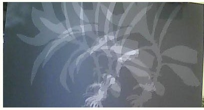


A small branch.

The test strip was exposed to 5, 10, 15 and 20 seconds. The best result for this one I think is the longer exposure time.


This is the full exposure of 20 seconds after I had done the test strip. I like how the white stands out so strong against the black background.


I tried moving the plant similarly to how I moved the lighter earlier. I kept a short exposure time of 2 seconds between movements and I also only moved it a few times. 


I used the same technique as the previous rayogram however this time I exposed it more times therefore the image appears darker.


I really like the forest-like look that the small branch gives off when moved. I might be able to incorporate this somehow into my animation ... maybe as a background.

Tuesday 5 April 2011

PRINT TO PIXEL - Research 2.

I continued my research into stop motion and realised that more was done by stop motion than I first thought, not only old animation but new animation too. Here are two examples of some really good stop motion.

Doritos Advert


This advert is using stop motion (recently) to create the illusion that the doritos are a tribe of their own. The crisps themselves appear to have human characteristics and I like the fact that stop motion is still used in animation today even with all the technology available.

Wallace and Gromit


This is a clip from Wallace and Gromit's - "A grand day out", in the scene when they are building the rocket. Aardman animations did an amazing job of bringing the clay characters to life and each one has their own personality.


PRINT TO PIXEL - Mood Board.

As you can see, I decided to use the idea of Evolution but also incorporate the repeat patters and colours. I created a mood board in my sketchbook with images and colour repeat patterns. Hopefully this will continue to inspire me in the creation of my background and style of my animation. 


The face paint and dress of the tribal people will be inspiring for any characters that I have appear in my animation and the evolution stages will help me in creating the frames myself.

Monday 4 April 2011

PRINT TO PIXEL - Animation Idea's.

In my sketchbook I came up with some ideas that I think would be really appropriate and fit my audio track really well. These idea's are expanding on initial idea's that I came up with earlier when I first listened to the track.


My two favorite idea's from creating these brain storms are the last two:
- Evolution and the growing of ape to man.
- Repeat patterns and the shapes that the sounds related to in my head.


I might combine these two idea's and try out a few techniques to mold the animation of an ape becoming a man and then also have repeat patterns that relate to the music. This way I will be connecting the musical beats and the idea of tribes being "a stage in social Evolution".

PRINT TO PIXEL - Research.

I looked into some artist research to inspire me in creating my own animation. Both of these artists I came across due to "Stumbleupon" - I saw them by accident and realised that they actually relate really well to this module. 

Terry Border
He adds simple wires, sets and props to inanimate objects giving them personality (anthropomorphizing) - I really like how he does this, here are some of his pieces.


I may use some of these techniques when creating my animation and then use photography to create a stop motion video... we'll just see.


Ryan Woodward
When I saw the stop motion video that Ryan Woodward created using drawing I was inspired. The drawings are fairly simple yet he brings them to life brilliantly. By using different colours for both characters it makes them stand apart from each other and the use of a plain, neutrally coloured background also aids in this. Here is the video.


Here is the link for the video as well :

I would love for my final piece to flow in the way this one does. It's extremely inspiring.

PRINT TO PIXEL - Rayograms.

We did a workshop in the darkroom to introduce us to the machines, in which we were also given 10 sheets of light sensitive paper for us to experiment with and create images using items we had brought in and different exposure times.


Straws - I allowed them between 5seconds and 30seconds exposure time. As you can see, the longer the exposure time the darker the image.


Straws - I did the same straws for this rayogram, however I allowed between 1second and 6 seconds exposure time which produced better results. 


Wooden Necklace & drawing pins - I exposed these items for 5seconds, 10seconds, 15seconds and 20second. The 20second exposure had the best results as it showed the curve of the pins.


Haribo Tangfastics - The clear sweets with sugar on created a really nice effect when exposed to the light and created an almost pixelated appearance.


I am hoping to go into the dark room again very soon and try out some other objects to create different effects and looks.